Purple and I have an interesting relationship. Not bad, soured, or traumatic, thankfully. Just different.
Of all the colours, purple – despite the fact that I find many shades of it to be arrestingly gorgeous – and I have never completely clicked.
Growing up in the 1980s and 90s, a time when the toy market was thriving like there was no tomorrow, (provided more than one colour option was made available) a great deal of the products released for young girls were either purple or pink.
Sure, plenty of them – from Keypers to Popples – included versions in both of those colours, and others could be found in hues such as sky blue, butter yellow, vivid fuchsia, and tropical vacation-worthy coral. Yet, to my mind – and certainly here in North America – it was pink and purple that garnered the lion’s share of the toy market for girls.
Be it then, prior to that point, or in the decades since, these colours have remained popular with youngsters and chances are, they won’t be fading away from toy store shelves anytime soon.
Reflecting on my childhood, for as far back as I can recall, I was gaga for the colour pink.
One of my first bedrooms had pink walls (topped with a cute pink and green wallpaper border that depicted teddy bears doing ballet – ahhh, the 80s 😄), a lot of the clothing I wore in my youth was pink, and I found that I gravitated to pink considerably more than purple.
There is nothing wrong with that, of course, but I believe the first strains in the relationship between myself and purple likely took hold when I became a card-carrying member of team pink.
Interestingly, purple is my mom’s absolute favourite colour (though she has never been the type to make their fave colour a centrepiece of their wardrobe or home décor).
I have always been a very independent soul and even in the days of pre-school, I can remember wanting to have different preferences in many instances to those of my parents.
Thus, it is entirely possible that I gravitated towards pink (whether consciously or subconsciously) so as to differentiate my favourite colour at the time from that of my mother.
Purple is a rare, regal colour that for much of human history was one of the most difficult to come by and therefore often amongst the most expensive as well.
Before artificial purple dyes were created scores of centuries later, the primary source of purple dye throughout much of the ancient world came from the mucus produced by a type of sea snail called murex snails which reside in the Mediterranean Sea.
Sources, including Pliny the Elder, tell us that thousands of these snails (which underwent a rather pungent-smelling ten-day brining process in a lead pot over low heat) were required just to make a single ounce of purple dye. Thus, the cost of obtaining items that were dyed purple was something only the wealthiest members of society could even begin to contemplate doing.
As a result, purple has long been associated with the elite, people of power, and, perhaps above all others, royalty.
Shifting from the days of My Little Ponies and Cabbage Patch Dolls to my tween and teen years, societally, purple continued to be a popular colour in many spheres as we inched ever closer to Y2K.
I can well recall several friends – and plenty more of my peers in general – being obsessed with the colour purple during that time.
It came into play with our Kabbodles, Lisa Frank school supplies and stickers, chunky glittery makeup (ahhh, the 90s – surely you saw that coming 😄), hair accessories (scrunchies, mini butterfly clips, and alligator clips, oh my!), clothing, Trapper Keepers, platform sandals, and so much more.
And throughout all that time, while I certainly never shunned purple, I remained loyal to pink.
As years of middle school morphed into those of high school, I didn’t feel the need to have/wear/decorate my room with “all the pink” anymore – but it still remained my favourite colour.
In some respects, it still is – particularly dusty rose, which is the shade of pink I most adore.
However, over the years, other colours such as black (which, I know, is technically not a colour but the absence of such), grey, red, burgundy, and aged metallics have long given pink a run for its money.
At no point, did any purple hue make my top five – despite the fact the fact that it is a decently common/popular colour in both the vintage and goth fashion worlds (these being the two subcultures that I have been most immersed in from my teens onward).
I tend to strongly favour having a cohesive colour scheme in my home (and wardrobe, too, for that matter). To date, neither of them has yet to feature purple in any major way.
And yet, all that said, I do not dislike purple in the slightest.
In fact, I would go so far as to say I love many shades of it. And purple will forever hold a special place in my heart given that it has been mama’s favourite colour throughout her whole life.
Much as with my clothing and home décor, my craft supply stash tends to lean towards certain colour palettes as well. There, too, purple does not tend to take top billing very often.
I can go multiple months running without a single spec of purple entering any of my craft projects.
This makes it seem like I am at odds with purple. Rest assured that I most definitely am not. Purple just tends to wait patiently on the sidelines until an outfit or craft project calls it up to bat, if you will.
Be it the palest shade of lilac or the richest eggplant (which, along with plum, shares the title as my favourite purple hue), purple is a versatile, dynamic colour that can convey so much.
It can be peaceful and evocative of youth, dark and vampy, upbeat and summery – and much more!
I was reflecting recently on how, for all my undying love of Halloween, I rarely weave purple into my All Hallows’ Eve or Samhain-related craft projects.
Lately, we have been bopping along through Springoween. Now that June has officially begun again, we are teetering on the cusp of Summerween. This point on the calendar seemed like a terrific time to reach for one of both of these season’s most iconic and adored colours.
Instead of pairing it with orange or green, as this colour often is in a Halloween context, I opted instead to lean heavily into the dark, bewitchingly elegant side of purple by teeming it with black, white, and gold.
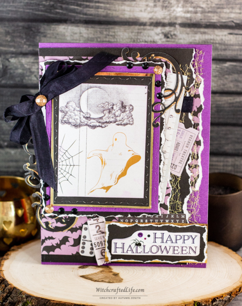
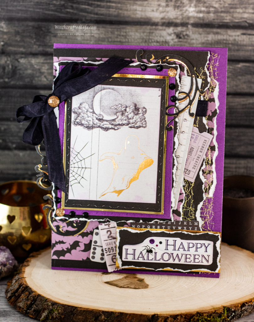
The end result is a delightfully spooky Halloween card that I can now give to my mom or to one of the numerous other purple adoring souls in my life.
And, as you have likely suspected already, this purple Halloween card also happens to be my June 2022 #MakeHalloween365 project share.
As always, sweet friends, please do not hesitate to use this fun and festive community-focused hashtag anytime you share a creative Halloween project anywhere online.
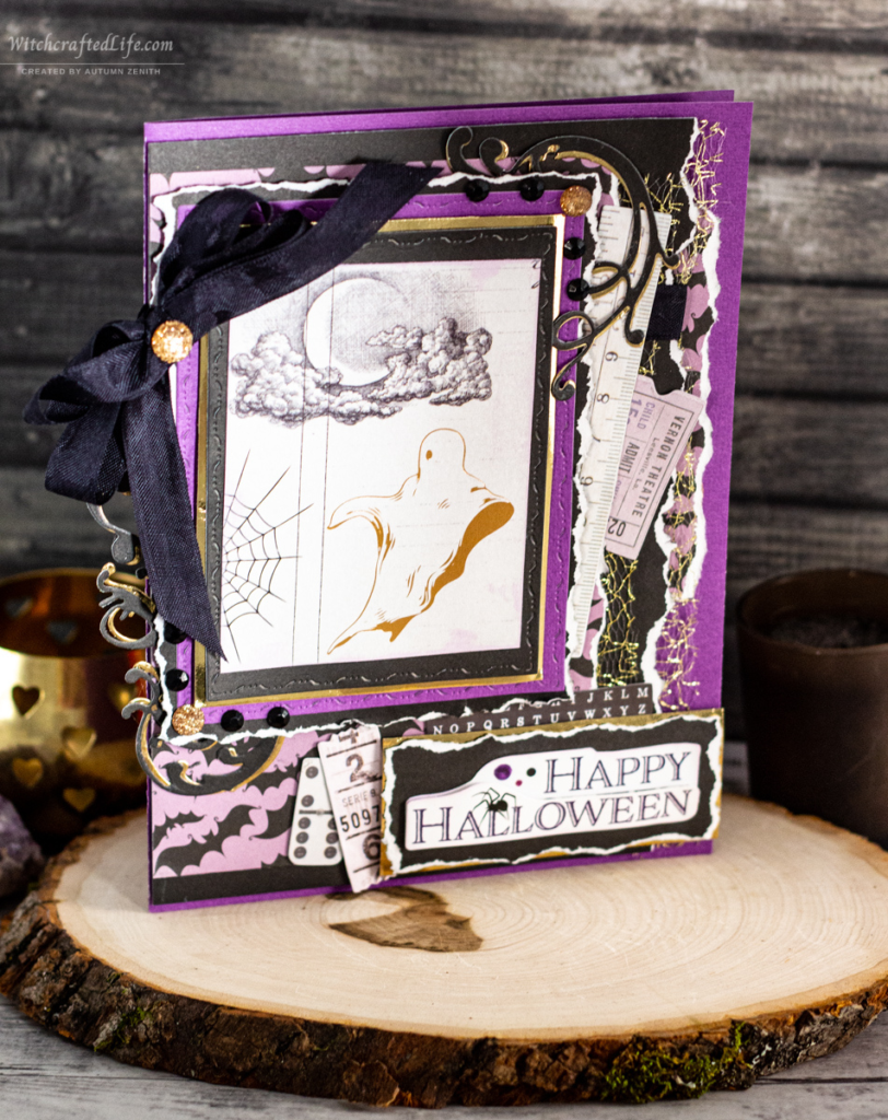
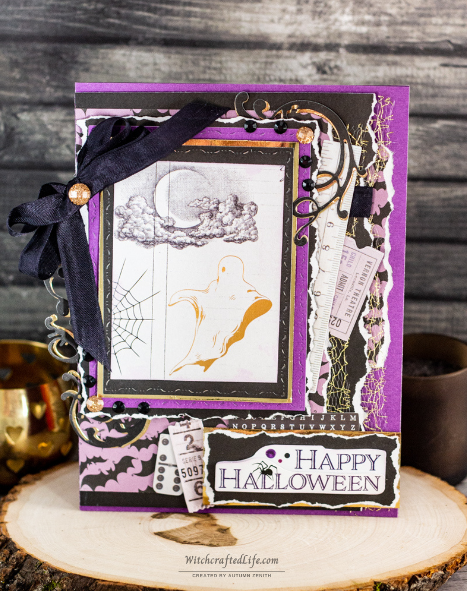
Gold ghost shabby chic purple Halloween card
In for a penny, in for a pound as they say, so having decided on making a purple Halloween card, I began with a purple cardstock card base and wove this colour into various other components of my design as well.
Much as I had a hankering to work with purple again, so too was I really in the mood for some classic shabby chic paper tearing/distressing that day and therefore it also appears throughout this festive handmade Halloween card.
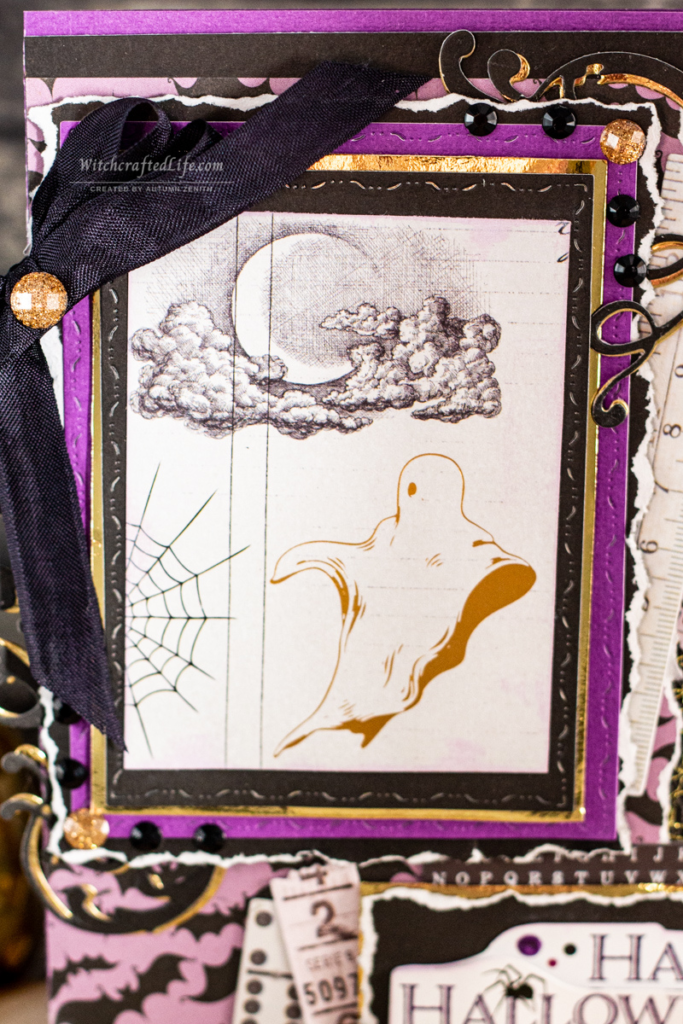
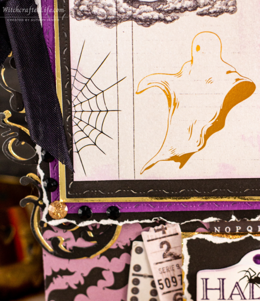
I am wild about the vintage-style illustration of a ghost rendered in gold metallic ink on the Prima Thirty One Collection paper that provides the star image for my latest handmade October 31st greeting card.
It is gothy, (quite literally) spirited, and ever-so-pretty, to boot! 🥰
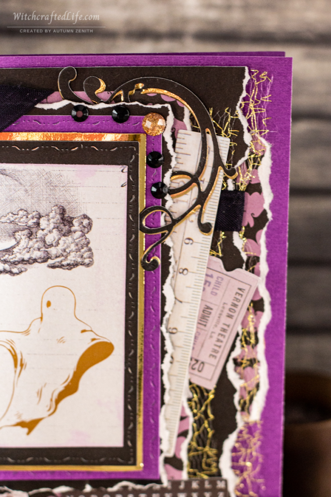
To carry the gold theme further, I included both metallic gold cardstock, glittery gold adhesive gems, and some fabulous gold coloured Webster’s Pages (oh, I miss that company!) tulle here as well.
I adore how the tulle resembles a gold-hued take both on spiderwebs and tattered fabric – say that of the disintegrating curtains in a long-abandoned haunted house. 👻
However, as I was aiming to ensure purple remained in the lime (or, should I say, lavender) light, I made sure to pepper this Halloween card with purple.
It appears as the card base, one of the matting layers beneath the ghost images, in a fabulous piece of light purple and black Echo Park bat print paper, in the fun little Prima ephemera pieces, as the only ink colour used in this card, and even shows up in the “Happy Halloween” sticker that I used for my sentiment.
If purple is your jam (err, grape jelly 😄), that of someone dear to your, or you are looking for a wonderfully gender-neutral colour palette when making your own Halloween cards, read on for a detailed list of the products used in this project plus step-by-step instructions on how to make one of your very own.
Products used to make this hauntingly charming vintage ghost Halloween card
-Black cardstock
-Purple cardstock
-Metallic gold cardstock
-Vintage ghost illustration paper – Thirty-One Collection All the Treats Paper from Prima (I used another portion of this same sheet of paper as part of my recent Happy Springoween Pocket Letter.)
-Black and purple bat print paper – Bewitched Witch Hat Paper from Echo Park
-Wavy stitched edge rectangle nesting dies (Plain, straight stitched, cross stitched, or just about any other type of rectangle nesting die set could be used here as well.)
-One or two different flourish dies (I used two different dies on this project.)
-Light opaque/chalky purple ink – Distress Oxide Milled Lavender Ink from Tim Holtz
-“Happy Halloween” sentiment sticker (This one is from a package of Crafter’s Square [Dollar Tree brand] of Halloween stickers that did not have a specific product name. I bought these stickers within the past couple of years, so they may be available again at Dollar Tree come the Halloween 2022 season.)
-All ephemera pieces used on this project – Rose Quartz Ephemera from Prima
-Black seam binding
-Metallic gold netting/tulle – Vintage Inspired Netting Collection 2 from Webster’s Pages
-Glittery gold gems – Say it Crystals Midnight Garden Self-Adhesive Embellishments from Prima
-Black gems – Balloon Blast Off Self-Adhesive Classic Gems from Forever in Time
-Dimensional foam, pop dots, or similar to elevate some of your layers
-Adhesive, such as a tape runner, of your choice (I often use my Scotch Tape Glider)
How to make a gold ghost shabby chic purple Halloween card
Begin by making a card base from purple cardstock.
Cut a piece of black cardstock a little smaller than your card base. Tear the right-hand edge in a random, intentionally imperfect manner. Cut a slender piece of Webster’s Page gold tulle/netting the length of the torn black cardstock. Position it so that this layer is flush with the left side border (aka, the fold of your card). Adhere to the underside of the black cardstock.
NOTE: All paper, cardstock, and netting/tool layers that follow are also to be arranged so that they favour the left side of this card’s design.
Then, cut a slender piece of the Echo Park bat print paper a bit smaller than the black cardstock and likewise tear its right-hand side.
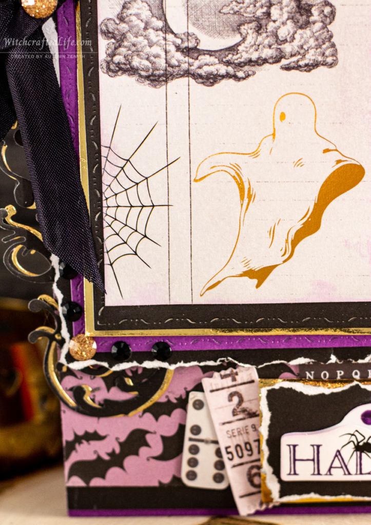
Cut a piece of black seam binding several inches longer than the width of the two pieces you just adhered together. Run it across the upper third of that area and adhere in place. Tie the two ends together into a bow on the left-hand side of the card.
Attach the bat print paper to the underside right-hand edge of the black beneath the bat print paper, then adhere this group of components to the card base.
Cut a piece of the Echo Park bat print paper a bit smaller than the previous layer. Tear its right-hand edge as well. Adhere.
Next, cut a piece of black cardstock a little smaller than the previous layer and, here too, tear the right-hand edge. Adhere to the previous layer using a dimensional adhesive such as Pop Dots or another type of foam squares/tape.
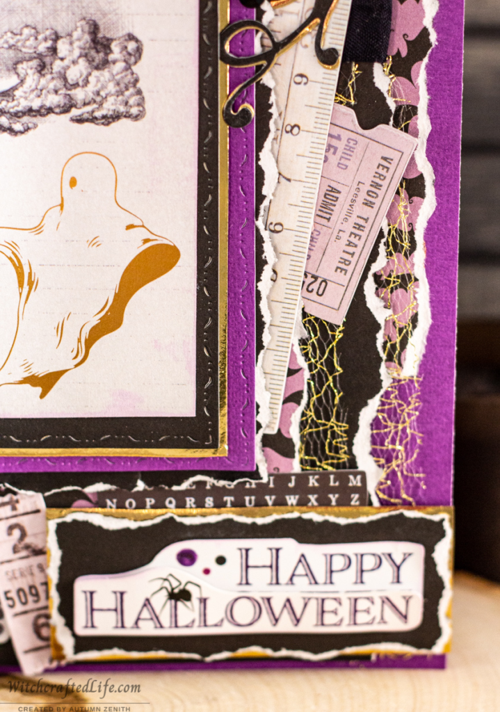
On the right-hand side of that (black cardstock layer) position and adhere a small piece of gold netting/tulle as well as the Prima light purple ruler and ticket stub pieces, as shown.
(Fun side note: While it is in reference to a US location, that lovely little ticket stub has the placename “Vernon” on it, which just happens to be the name of a neighbouring town located less than twenty minutes south of us.)
Using black cardstock and metallic gold cardstock die cut two pairs of matching flourish shapes. Arrange and adhere each matching-shaped flourish together with the black ones as the top layer. Off-center them a little so that a glimmer of the gold layer is still visible.
Tuck these flourish stacks under the lower left-hand side and upper right-hand side of the latest (torn edge) black cardstock layer that you created.
Using a larger-sized wavy stitched edge rectangle nested die, cut a rectangle from the same purple cardstock that you used for your card base. Adhere using dimensional adhesive.
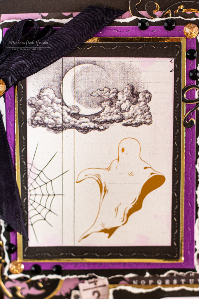
Cut the central ghost panel image from the Prima Thirty One Collection All the Treats paper and ink all of its edges with Milled Lavender ink.
Then cut a gold metal cardstock matting layer a smidge bigger than the dimensions of that piece. Adhere the two together.
Die cut a smaller wavy stitched edge rectangle piece (that is large enough to work as a matting layer for the gold cardstock layer you just made) from black cardstock. Adhere previous gold cardstock + ghost image layers to this piece of cardstock and then adhere it to your previous layers.
Next, cut nested layers (by hand, with dies, etc) of gold and black cardstock, respectively, to mat beneath the sentiment sticker. Adhere those layers together then top with the sentiment sticker (optionally inking the edges of the sentiment sticker with Milled Lavender Ink, as I have done here). Adhere these elements on the lower righthand side of the card.
From the Prima ephemera, arrange and adhere a small alphabet piece so that it is sandwiched between the bottom of the central ghost image panel layers and the sentiment sticker layers, as shown.
Then, tuck a light purple domino and a light purple raffle style ticket under the left-hand side of the sentiment, angling them to the left a bit.
Place one of the largest sized gold glittery Prima gems on the middle of the black seam binding bow (you may wish to add some extra holding power to the adhesive that is there already by reinforcing it with hot glue, strong glue dots, or a heavy-duty crafting glue such as E6000 to ensure this gold gem stays put) and then position one somewhat smaller sized gold sparkly gem on the lower left and upper right-hand sides of the wavy stitched edge purple cardstock layer.
Surround each of these gold gems with two small black gems on either side, as shown.

And there you have it, one eye-catching purple, black, white, and gold Halloween card that can be made in scarcely more time than it takes a ghost to say “boo”. 😃
Compared to many of my projects there are not, relatively speaking, all that many steps nor a huge volume of different materials required to make this eerily fun Halloween card.
If one used a template, paper trimmer, or scissors to cut out the rectangles and, optionally, nixed the flourishes, this delightful ghost-themed Halloween greeting could be made without the need for a die cutting machine.
This design is one that marries sweetness with spookiness (a perpetual fave combo of mine) and which is both timeless and ideal for October 31st fans of all ages and genders. 🖤
From spirituality to coal tar, a (super) brief look at the meanings and history of purple
As much as we tend to associate purple with spring and summer in the Northern Hemisphere, it can certainly work well as a year-round colour.
Purple is a colour with strong ties to many things, including both spirituality/mysticism and creativity/artistry – not to mention a long-standing history of use within the LGBTQ+ community.
Given that it is the lovechild of red and blue, purple embodies elements of both fiery warmth and serene coolness.
For all the pale, pastel shades of purple out there, one finds even more that are bolder and more commanding.
Perhaps that is why – especially when combined with its relative rarity in the natural world – purple leaps out at us in many settings.
It might not be as glaring as bright yellow or orange or as tranquil as a soft blue, but it is apt to grab our eye all the same.
Both in terms of colour psychology and the meanings often linked to purple in the witchy/Pagan realm, this purple can represent such areas as intuition, peace, independence, beauty, sensitivity, understanding, empathy (and empaths), the unknown, power/status, pride, dignity, protection, wisdom, creativity, devotion, enlightenment, health and healing, openness, psychic abilities, the crown chakra, magic(k), and death – amongst numerous other things.
In fact, so closely tied to death and mourning was the colour purple to the Victorians, that it was one of just a few colours that were permitted back into a person’s wardrobe when they were in a period of half-mourning (following various lengths – often depending on the mourner’s relationship to the deceased – of full morning, which was also known as deepest mourning, during which only black was supposed to be worn).
Doing so was made all the more possible by the fact that in the very same era (in 1856, to be exact), one of the first synthetic purple dyes was invented.
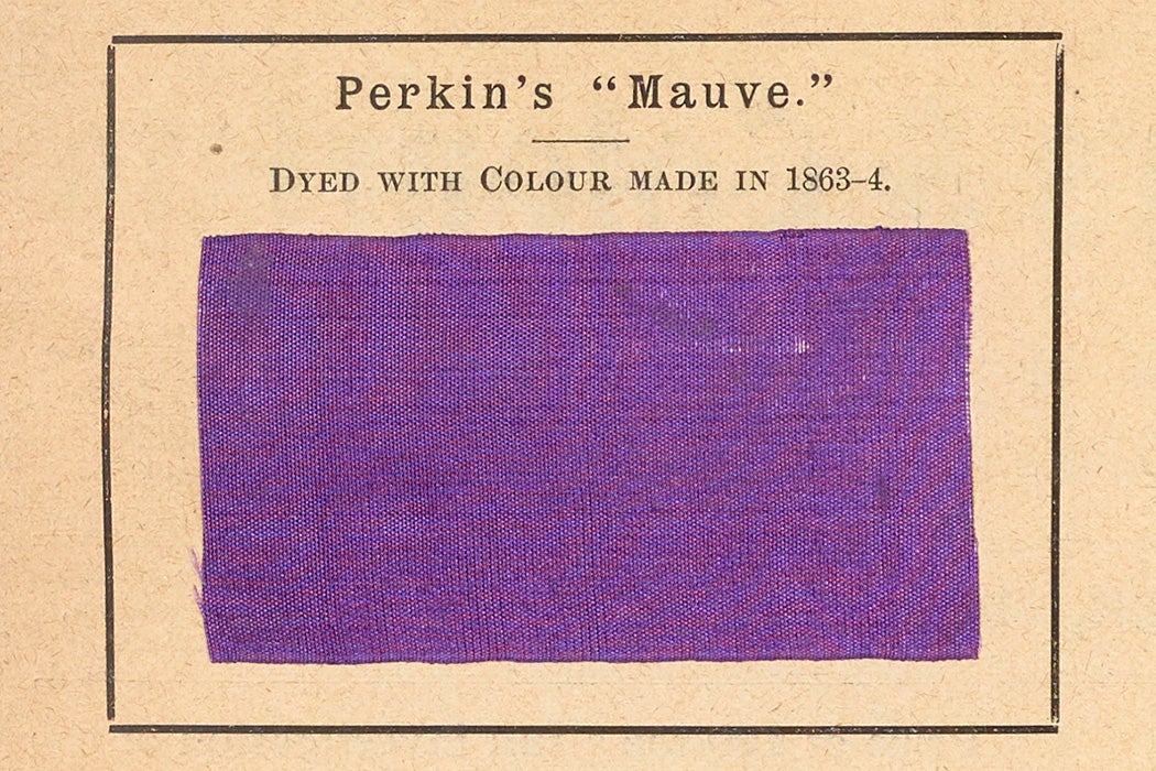
Originally dubbed “aniline purple” by its then eighteen-year-old inventor, William Henry Perkin, this dye – which would later be known by the name mauveine – was created out of coal tar.
In the years and decades to follow, many other synthetic purple dyes – some certainly safer than others – came onto the market as well.
As a result, purple began to be a colour that was within the reach of more people and, accordingly, was frequently seen not only in times of half-mourning but in the day-to-day wardrobes of many Victorian individuals (it was wildly enjoyed by both women and men).
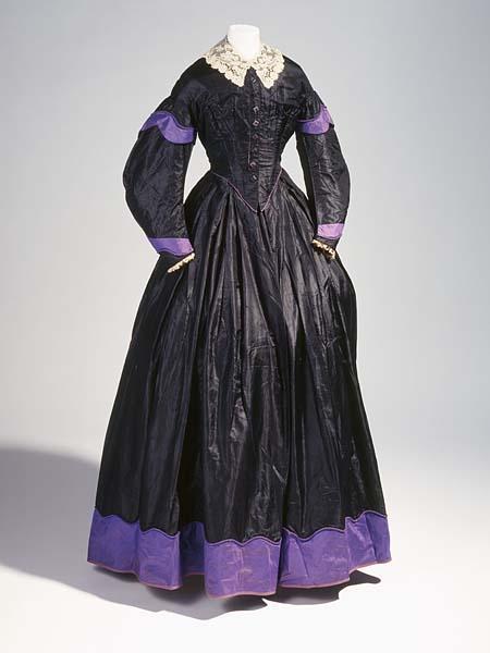
Purple also made a splash in terms of home décor, the art world (purple pigments and paints had been available prior to that point, but were often very costly and did not always promise long-term colourfastness), and as a result, was a much-favoured choice in terms of flowers + floral arranging, too.
As time went on, more and more forms of artificial purple dye were invented and used to colour a huge range of goods (including certain food, too, such as candy and grape soda).
And while, these days, purple has still managed to retain ties to the rich and famous, royalty, and religion, it is very much a colour that the majority of people around the world can access, if so desired.
In addition to the purple correspondences touched on above, spiritually speaking, purple is also associated with such things as the element Air, the number seven, the planet Jupiter, the cardinal direction of east, the fae, wands, cauldrons, spiritually significant jewelry and clothing (very much including robes/cloaks), the spirit world, and Pagan pride.
To circle back to where this post began, it is true that purple and I have not always been the closest of friends, but we share a bond that spans my entire lifetime and I have never viewed purple in a negative light or disliked it for a moment.
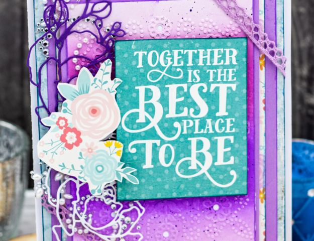
This is not the first paper crafting project I have made over the years that starred purple (in terms of those since the creation of my current blog, this Shabby Chic Springtime Bloom Card really stands out for me) and it is a safe bet to say that it won’t be the last either.
Especially since, again, this royal shade is my mom’s favourite colour.
Not wearing, decorating, or crafting with purple all that often as makes the times when I do opt to do just that all the more special and standout-ish to me.
Two adjectives that apply abundantly as well to my – and countless other peoples’ – cherished Halloween.
And therefore, that is all the more reason for me to reach for shades of purple spanning lilac to mulberry, orchid to mauve – and, of course, that most witchy approved of purples, amethyst – when creating some of my numerous annual Halloween papercrafting projects.
Are you a big fan of purple? Do you enjoy including this versatile and very pretty colour in some of your creative projects as well? ✨💜✨
PS: I am well aware that if you try to say the name of this blog post five times fast, it instantly becomes a tongue twister. 😄
A beautiful card and so intricate with all the different parts. I have never yet made a card so I find this really informative.
I am in the ” I love purple” camp though. Adore the colour and have since early childhood though I do not exclusively wear it. But if there is a choice of colours I tend to veer towards purple, especially the darker purples.
If there is a choice in fabric types for my crafting I have difficulty restraining myself from buying purple even though my head knows that it would be so easier to wear black or navy or grey.
I currently have dark purple curtains in my sitting room which really do not go at all with the mostly green and cream room! There are though a few purple cushions which kind of normalize the look but I should probably change my curtains at some point in that room.
Thank you deeply, sweet Bracken. You are wonderfully kind!
While I certainly don’t profess to know everything on the topic, humbly, I have picked up a fair bit of knowledge + firsthand experience with paper crafting. Should you ever decide to venture down the card making path and have any questions pertaining to papercrafting, please do not hesitate to either ask them in the comments of my posts or to zip an email my way anytime.
I adore chatting about this topic and could happily do so from sun up to sun set.
Thank you very much as well for sharing about your love of purple. It really is an enchanting colour and one that I have definitely been enjoying working with a bit more as of late.
I hope that you had a great June and that this month will blossom into a sunny, safe, and very enjoyable July for you. 🌞
🖤 Autumn
I think I can relate to the pink/purple as it has always been my favorite colors! I don’t wear or have home décor with the purple color myself, but in art for sure! 😉 Your card is beautiful done with all of the torn layers for texture and the aesthetic feel of Halloween! Love the images and your ribbon treatment really sets it off with a Vintage vibe too! Thanks for your wonderful inspiration!
Likewise all the way! (Though, that said, there is a wee bit of purple in some of the art and decor in one room of our house.)
Thank you immensely, my sweet friend. As paper crafters surely there are far more encouraging + meaningful things to be told than that our work inspired a fellow creative soul (yours does so every time I visit your wonderful site).
Big hugs & the happiest of wishes for a great lead-up to Halloween!
🖤 Autumn
Although growing up in the sixties and seventies, when pink and purple didn’t make up the lion’s share of colours used for girls’ toys, I only started appreciating pink when I was well past my 30s. When I outgrew my primary school wallpaper, I insisted on orange 🙂 But that’s the seventies for you! As for purple, that’s definitely a colour I’ve got a love/hate relationship with. I wore a lot of purple in my 30s and early 40s, then I avoided the colour for many years. Now, it is back on, in moderation 🙂
Your card is another triumph, even though I’ve got my tongue in a twist after trying to say your post title aloud. xxx
Hello sweet Ann, thank you very much for your wonderful comment and for sharing more about your own up and down ride, so to speak, with purple over the years.
I adore that you were gung-ho for orange walls back in your youth. I bet they looked very cool and thoroughly on-trend at the time.
In the ensembles I’ve seen you wear that involved purple, I always thought (and continue to think, of course) that it was fantastic on you and look forward to being inspired by future ways in which you sport this regal hue. 💜
Huge hugs & the utmost of appreciation for all of your recent blog comments.
🖤 Autumn
Beautiful scene and card Autumn. Enjoyable pos,t as always.
You are such a sweet, wonderfully supportive soul, Donna. Thank you SO much for your support, kindness, and the time that you share with my wee corner of the internet.
Being impacted by Bloglovin’ not working throughout much of June, I am rather behind on the sites I follow and very much apologize for not returning the visits as of late.
I am currently on the hunt for a reliable new feed reader and will be adding your blog to that one as well on the double!
Sunny hugs & the happiest of wishes for a great July!
🖤 Autumn
As a child I didn’t just like purple I was obsessed with Violet, pronounced the French way I might add! Ha ha! As an adult I go through stages of wearing a ton of purple, then wearing none. I saw an older lady yesterday with purple dip dye hair and a purple shawl and she looked fabulous!
Beautiful card.
That is all kinds of cool – right down to opting for the chic French pronunciation of the word “violet”.
(Interestingly, the girl’s name Violet is one that appears periodically 2+ generations back on one branch of my maternal family tree.)
What a stylish woman you spotted. I bet her closet is amazing!
I hear you regarding wearing purple. While not all shades of it look good on me by any means, a handful (especially berry, plum, and eggplant/aubergine hues) of them do and I too tend to cycle in and out of wearing them frequently or not.
Many thanks for your wonderful comment – coupled with all those you so sweetly left for me here this spring. They are always, always greatly appreciated.
Here’s to the prospect of a sunny, safe, and hopefully very enjoyable July!
🖤 Autumn
I have always liked purple, ever since I was a kid – which is kind of funny, as it’s one of the colours my mom does not like for clothing at all (she grew up hearing that it was a colour for “loose women”, ha ha). Much of my clothing in the 70s was hand-me-downs and I remember a couple of purple pieces that I really loved: a striped turtleneck and a violet miniskirt.
As an adult, it’s always been a favourite. Heck, I had dark purple hair for many years (close to 5-6 years) and still dye my hair lavender!
Love this gorgeous card, Autumn! You’re so talented!
Oh my word, that really says a lot about how far we have thankfully come in terms of how society views both women and certain colours. I will have to ask my 91-year-old grandma if she heard the same thing about purple when she was growing up (in the Yukon), too.
Purple looks AMAZING on you, my dear friend. From your locks to your garments, jewelry to shoes, it shines more brilliantly than a freshly polished amethyst whenever you sport this fantastic colour.
You are exceedingly kind! Thank you very much for the super sweet compliments.
As June lacks the 31st day, as I type these words, we are as close to the four-month mark until Halloween as we can get this month and that thought has conjured up no shortage of fun new October 31st-related projects that I hope to make in the coming months.
I would be beyond elated to send one of them to you and L, if you would like. 🎃
Huge hugs from (finally!!!) sunny Armstrong coupled with the happiest of Canada Day wishes! 🌞
🖤 Autumn
I don’t think I am going to try to say the name of this blog post five times fast, my tongue would be twisted after just 2 times!
Thank you for this wonderful history of the colour purple. It spurred me to get my book called The Secret Lives of Colour by Kassia St Clair, down from my shelf and look it up and I have another little fact to add.
Apparently William Perkin was trying to produce quinine from coal tar. He never did produce quinine (a treatment for malaria) but, as you say, invented mauve dye in the process. Fascinating stuff. I always learn so much from your posts.
Your card is beautiful as always, full of interest and little details that all hang together so well. I am glad you have used purple as it is a fabulous colour and works very well for Halloween xx
Thank you abundantly on every front, my very lovely friend – including for adding more to the history of how one of the Victorian era’s most popular colours came to be.
I have been eyeing that book from the moment I first caught wind of it back in 2019 and really hope to buy or borrow a copy one day, too. It is up my alley on countless fronts!
Having leapt into the purple side of the pool, so to speak, I am really enjoying working with it at the moment and am intrigued to see if that current interest in it carries over the fall months.
Thank you again so much for everything. I sincerely apologize for not visiting your blog lately. It stems from the fact that the feed reader (Bloglovin’) that I was inexplicably down for almost all of June (and also at various points earlier in the year). Therefore, I missed out on about a month’s worth of posts from the blogs I follow – yours included, of course.
I am currently on the prowl for a reliable new feedreader and will be adding your site to it as soon as I hit upon a winner.
Tons of hugs & the happiest of wishes for a great July coming your way!
🖤 Autumn
Autumn, I love your detailed and colorful cards! The colors are perfect!!
You are such a sweet, thoroughly supportive soul, dear Celeste. Thank you very much for your kind words about this fun purple Halloween card.
It was a blast to make! Given that purple is my mom’s favourite colour, perhaps it will end up going to her this year.
My sincere apologies for being MIA as of late on your wonderful blog. As a Bloglovin’ user, I have been dealing with that platform being down for nearly all of June (as have others who utilize this feed reader) and therefore lost out on about a month of posts from your site and the others that follow.
I am presently on the hunt for a reliable new feed reader and will be adding your blog to that one as well the second I hit upon a winner.
Wishing you a sunny, joy-filled July!
🖤 Autumn
Guess what? purple is my favorite color and I can never get over from it. I am just so obsessed with it. Autumn I love how you add creativity in all of your designs. Just keep the good work going.
Thank you very much, Olivia! You are making me blush more than the local cherries that are coming into season once again around our region of BC.
I really appreciate your kindness, support, and the time you’ve been sharing with my site as of late.
Wishing you a fantastic, fun-filled, and very happy July!
🖤 Autumn
Wonderful card, love the shade of purple.
Thank you sweetly, my lovely friend. When it comes to purples, I tend to be most drawn to the medium and dark shades of this elegant colour and opted for one that falls somewhat in the middle of the two so as to keep the colour palette a bit airier and more spring/summer-ish. I am delighted to know that you’re a fan of this terrific hue as well.
Big hugs & tons of joyful July wishes coming your way!
🖤 Autumn
I have a love/hate relationship with purple,love the rich deep shades like those in your card which has a wonderful vintage feel,lots of form edged layers to explore and fabulous embellishments
I hear you, Meg, I totally hear you. While I don’t hate purple (or any colour, really), we definitely have a long-standing on-again, off-again relationship as well. And like yourself, I am generally most drawn to the medium and darker shades (with eggplant/aubergine being one of my very faves on the side of the purple spectrum).
Thank you very much for your super sweet compliments and for spending time here on my blog all throughout the weeks and months of spring. I greatly appreciate it! 💗
Sunny hugs & the happiest of wishes for a marvellous summer!
🖤 Autumn
What a beautiful card! ♥ And again, we are exactly alike. I don’t dislike purple either, but I don’t choose it. And have I misused pink!!!? All shades during the eighties to the zeroes.
Shocking pink was my absolute favourite in the eighties. If it wasn’t pink I wouldn’t own it. It was a true obsession. Perhaps purple got a bad reputation during the seventies, which I remember too well.
Then about ten to fifteen years ago I finally shied away from pink, and turned to green, which I had never dared due to the fact that my surname is Green, and I thought everybody would tease me – no one does, ha.
I love all colours, some in small doses and some doesn’t become me (like orange and yellow), then they become accessories.
Have a lovely day, dear. 🙂
You are exceedingly kind, dear Sanne. Thank you very much for making me blush for the super sweet compliments you paid this fun purple Halloween card.
I adored learning more about your own connection not only to purple, but with pink and green as well (both of which I think look fantastic on you!).
Same here all the way! There is no colour I hate and few I won’t wear, be it in tiny doses or head-to-toe, as the case may be. I have very little purple in my current wardrobe, but much as I’ve been crafting with this colour as of late, I’ve been sporting some of the few purple pieces I do own this spring as well. 💜
Big hugs from (finally – we had such a cool, damp spring here this year) sunny BC!
🖤 Autumn
Purple is only a small portion of my wardrobe as well and rarely appears in my decor. Having said that, I too appreciate the various shades of this royal color. You incorporated it beautifully in your card. The tulle and gold elevated the look even more.
And, would you believe, I too have a small town called Vernon- less than 30 minutes away?
Debi
What a cool coincidence! How big (population-wise) is your Vernon? As of last year, I read that ours was in the 45,000 range. So not itty-bitty, but certainly not a sprawling metropolis either.
Thank you very much for your super sweet words about this charming purple Halloween card. It has since inspired a different (non-spooky season-themed) project and I have ideas for plenty more swirling around in my head these days.
It will be interesting (to me at least 😄) to see if my current romance with purple wanes as the summer winds down or if it will keep going strong right on into our favourite season. Only time shall tell!
Huge hugs & tons upon tons of joyful July wishes!
🖤 Autumn